


Hinge
UX/UI, Concept
Hinge is an online dating app that is built on the belief that anyone looking for love should be able to find it. It's a dating app for people who want to get off the apps and meet in real life.
PROBLEM
After a year of social isolation and lack of in-person interactions, single people are slowly getting back into the dating scene as the world adapts to the new normal. As one of the popular dating apps, how can Hinge further encourage singles to go on more first dates instead of becoming online pen-pals that eventually lead to digital exhaustion and ghosting?
GOAL
To discover what people look for in a successful first date so we can understand how to create a useful feature on Hinge that can help enhance the online dating experience.
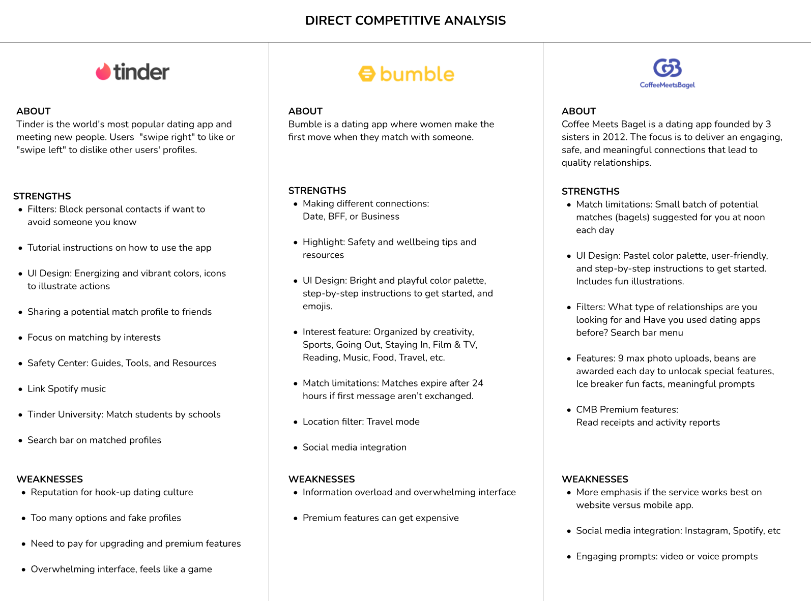
COMPETITIVE ANALYSIS
In order to better understand the current dating trends, I researched the three popular apps (Tinder, Bumble, and Coffee Meets Bagel) to discover patterns and common features.
UNDERSTANDING USERS
I conducted five user interviews (ages 25-35) on Zoom to understand their motivations and frustrations when online dating and planning first dates.
Motivations:
• Sense of hope
• First date suggestions from friends
• Dating app premium features
Frustrations:
• Time consuming
• Outdated or fake profiles; catfishing
• Pressured to be witty and funny
• Feels like a game, instant satisfaction
• Profiles only capture a glimpse
• Endless swipes
• Expectations for initial spark
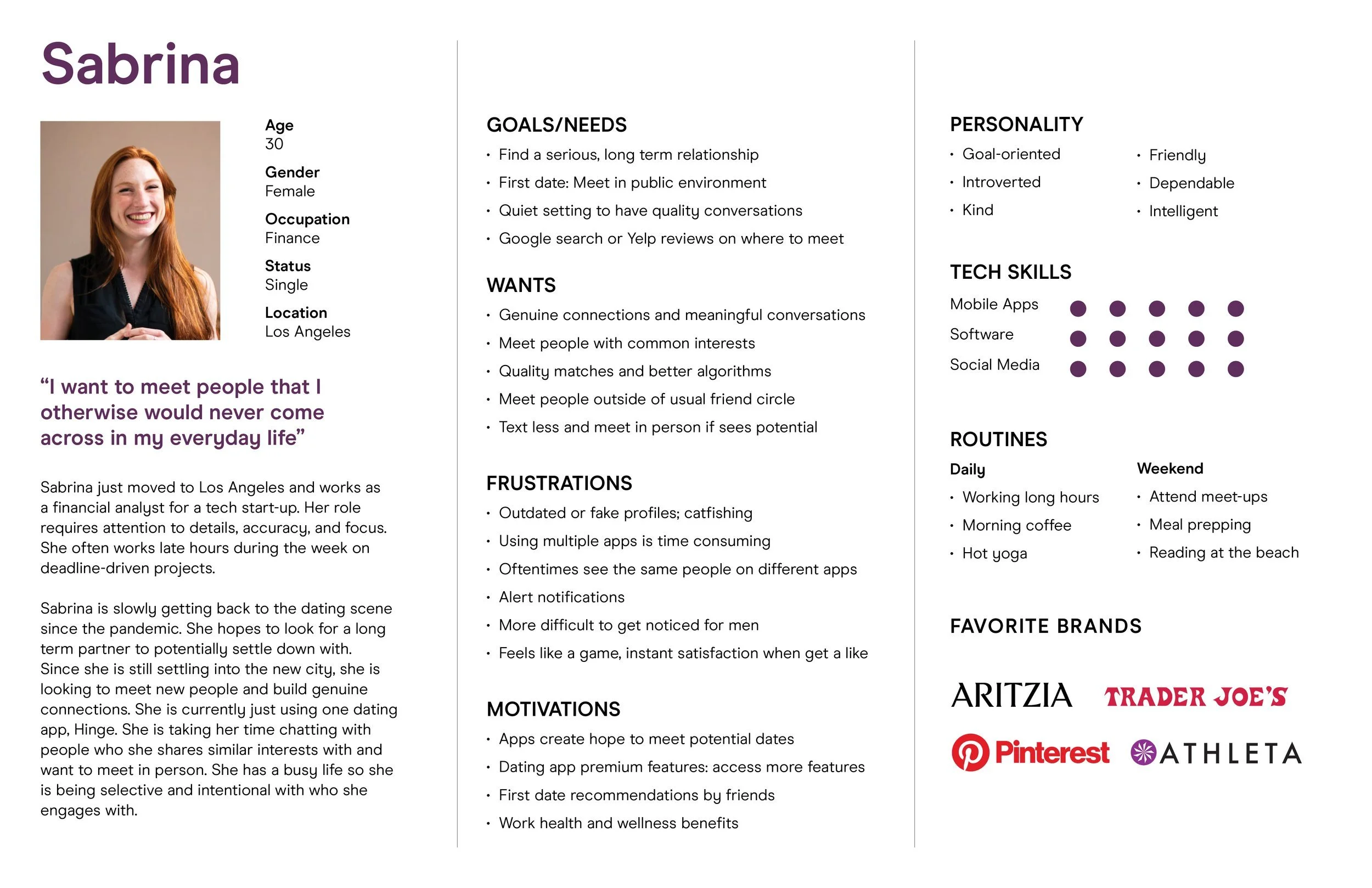
PERSONA: MEET SABRINA
Based on the user interviews and market research, I created a persona, Sabrina, who represented an ideal user for using online dating apps.
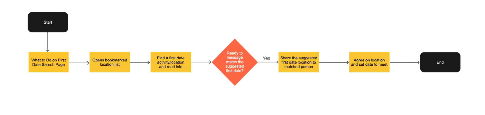
USER FLOWS
After creating the persona, I thought about two main user flows that Sabrina would make.
User flow #1:
Searching for a first date location
Sabrina has been chatting with a guy she matched with for a few days. She feels that she is attracted to him enough to set up a first date to meet in person. Although they both live in Los Angeles, traffic is another factor to consider so she suggests to find a midway point. She clicks on the Search icon and looks at meeting options to suggest to her date.
User flow #2:
Searching for a first date location from bookmarked list
Sabrina has been chatting with a guy she matched with for a few days. She feels she that she is attracted to him enough to set up a first date to meet in person. They both live close to each other so she takes a look on her bookmarked list and recommends a place to meet.
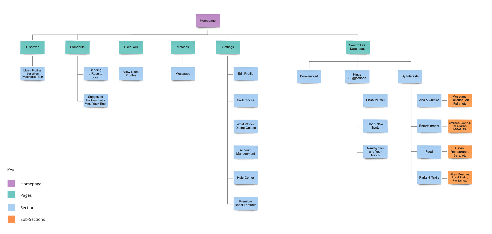
SITE MAP
The architecture of Hinge includes features that are currently on the app and shows where the new added feature will incorporate into the interface. The "Search for First Date" feature is visible through the message screen as an icon or notification alert and includes a curation of categories by interests such as Outdoors, Arts and Culture, Entertainment, and Food.
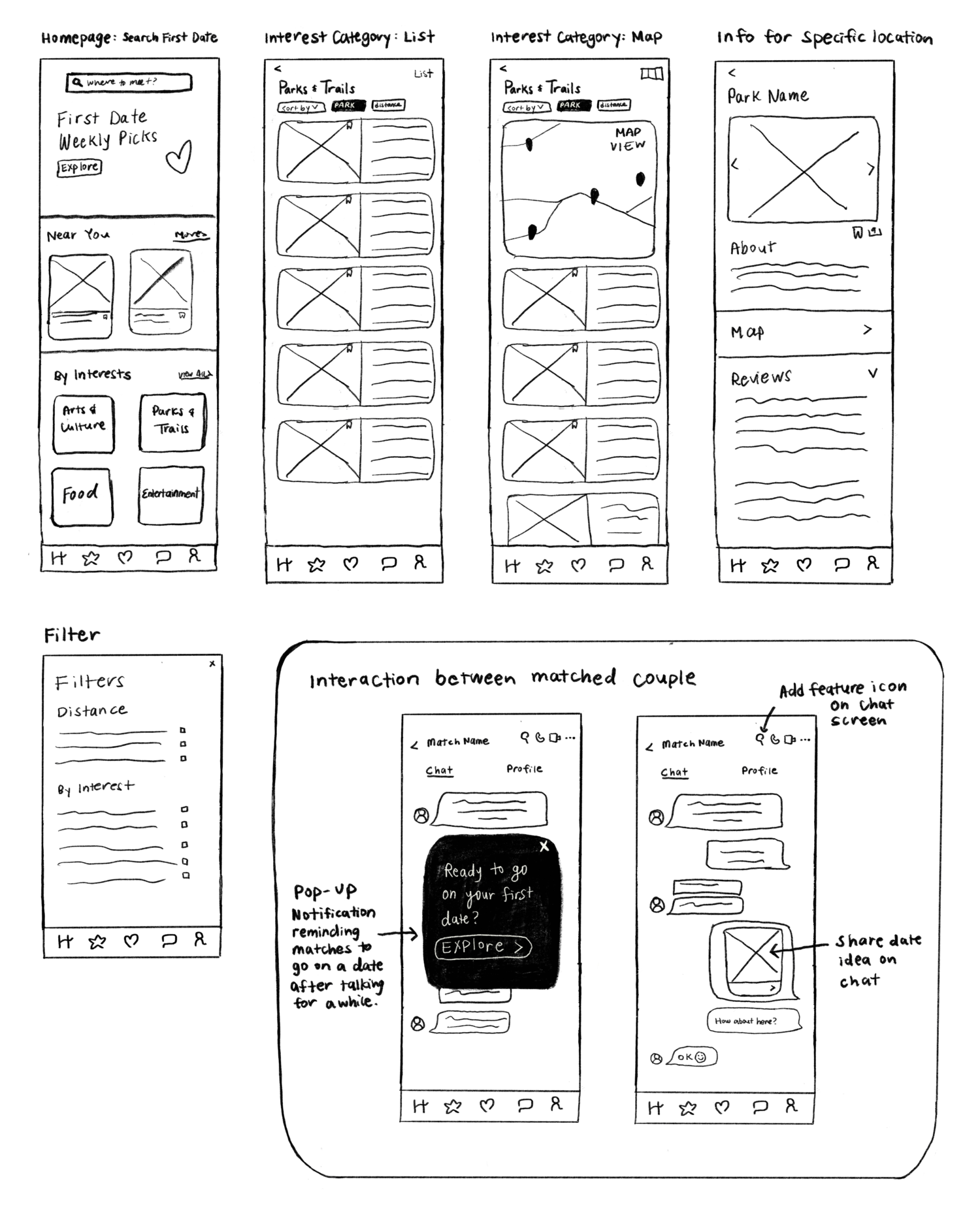
WIREFRAME SKETCHES
Based on the site map and reviewing the current interface, I created wireframe sketches for the "Search for a First Date" feature, focusing on the homepage and destination informations.
The main focus is envisioning where this feature lives within the app when two individuals interact. After analyzing, the messenger screen makes the most sense to add this function. Instead of creating another icon tab, the "Search for First Date" icon sits next to the call icon on top of the messenger screen. This provides user easy access and visibility to the feature.
Another consideration for visibility of this feature is while two individuals are in the middle of talking, a pop-up notification will appear, prompting users to explore first date options.
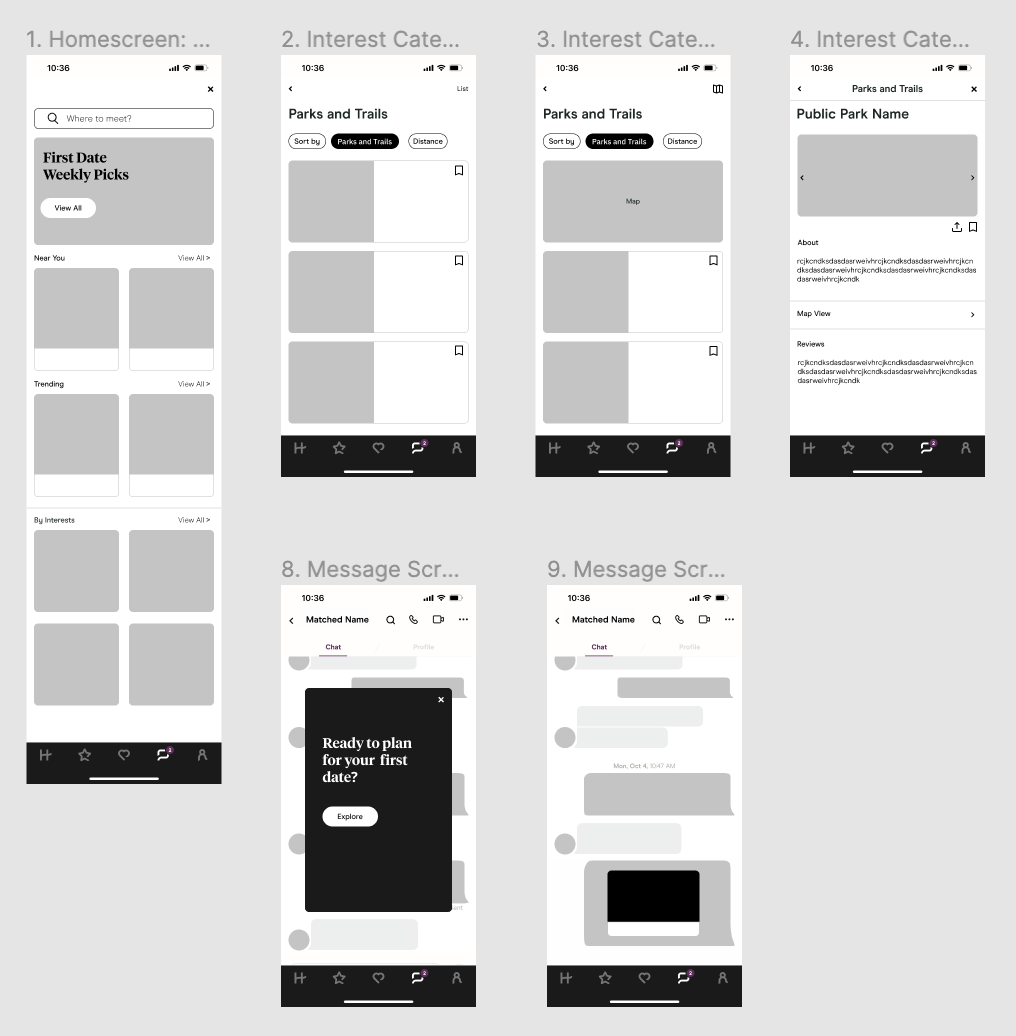
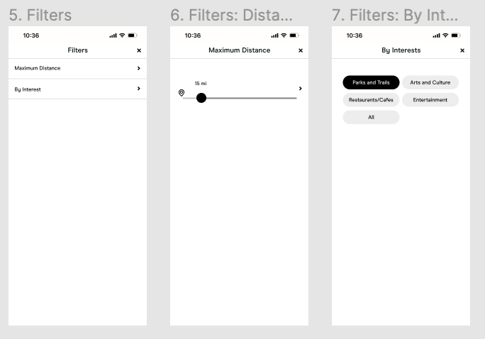
LOW-FIDELITY WIREFRAMES
"Search for a First Date" screens:
From the sketches, I developed low-fidelity wireframes including copy, layout cards, and icons that visually complement and is on brand.
UI STYLE GUIDE
I followed Hinge’s current visual system (fonts, sizes, color palette, icons) and incorporated additional elements that aligned with the brand.
1. Message Pop-Up Notification
Sabrina matched with Brian a few days ago and they have been messaging each other daily, chatting about common interests such as their love for the outdoors. They both have good feelings and agree to meet in-person.
Sabrina receives a pop-up notification asking if she is ready to plan her first date. She clicks on the Explore button and it takes her to the homepage screen of the first date search feature.
2. Home Screen: Search
Sabrina browses the home screen and looks at the curated section by Interest. She clicks on the Outdoor category and looks for nearby parks.
3. Suggesting a Place
Sabrina finds the Silverlake Reservoir and reads the visitor reviews. She decides to suggest this place and clicks the share icon to message.
USABILITY TESTING
I conducted a remote usability test to observe and understand how participants interact with the new added feature when looking for a first date spot.
Test Goals
• How users easily complete a task
• Overall quality and flow
• Observe any frustrations
• Discover any user patterns
Participants: 4, Ages: 30-35
• Looking for connections
• New to dating or getting back to it
• Used online dating apps before
NEXT STEPS
With time and further behavioral data collections, this feature can be expanded taking into account cultures, environments, and transportation pertaining to city profiles. Depending on the environments, the filters and curations will adapt to the designated profile.