


reikflo
UX/UI, Brand Identity, Website
Reikiflo’s mission is to bring awareness of reiki practice and make energy work more accessible and affordable through virtual treatments.
DEFINE THE PROBLEM
Since the pandemic, there have been an increase in virtual health programs and mental health apps. As the UX/UI designer, my job is to help my client redesign a wellness website that will attract new clients and have returning clients book follow-up sessions.
GOAL
To understand what information clients look for when browsing a wellness website and how to create seamless online booking experience.
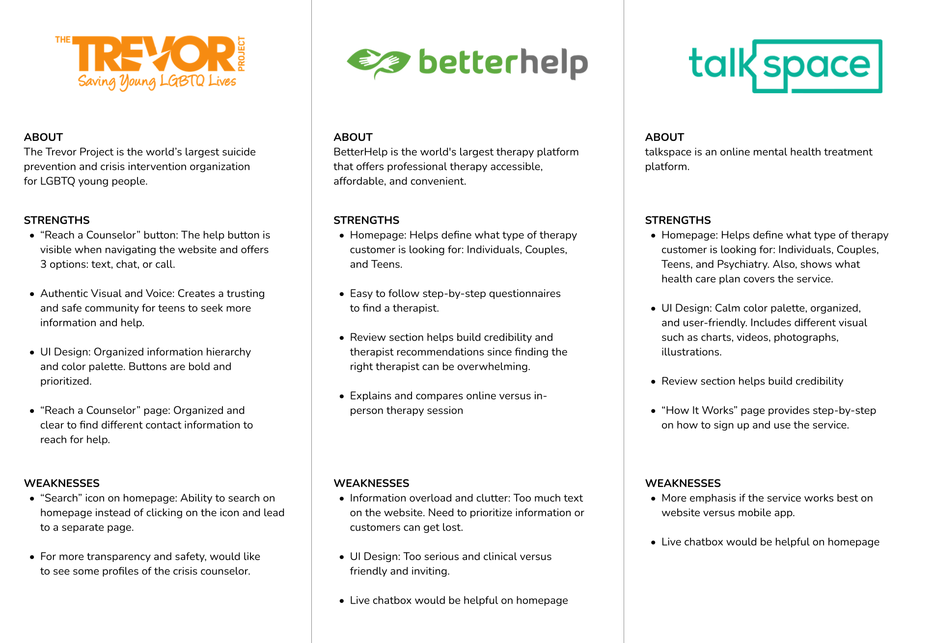
COMPETITIVE ANALYSIS
By analyzing the market competitors and health and wellness trends, I was able to identify patterns across similar services. This helped me better understand where reikiflo should be positioned in the industry and think about the target clients that would be interested in this practice.
UNDERSTANDING USERS
I conducted seven user interviews (ages 25-35) on Zoom to understand their motivations and frustrations when trying new health practices and making health appointments.
Motivations:
• Friend recommendations
• Practitioner’s credentials and experience
• Direct benefits, how it works, side effects
• Book appointments online
• Client testimonials
Frustrations:
• Cost
• Unfamiliar medical terms
• Incorporate to daily routine
• Appointment availability
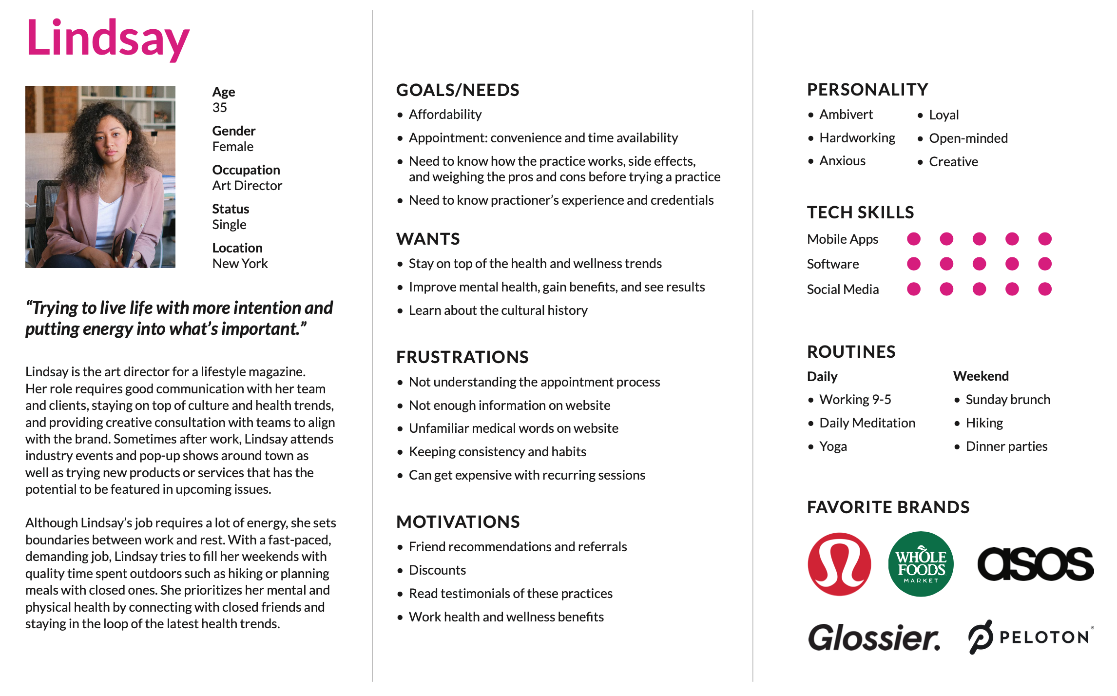
PERSONA: MEET LINDSAY
After speaking with the client about the target audience and demographic, I created a persona named Lindsay that represented an ideal client. With a busy lifestyle, Lindsay prioritizes personal growth and mental health. I focused on what Lindsay’s goals, wants, frustrations, and motivations when trying a new health practice.
USER FLOWS
Following along Lindsay’s journey to booking an reiki session, I thought
about her decision-making process when booking a new appointment for a new practice.
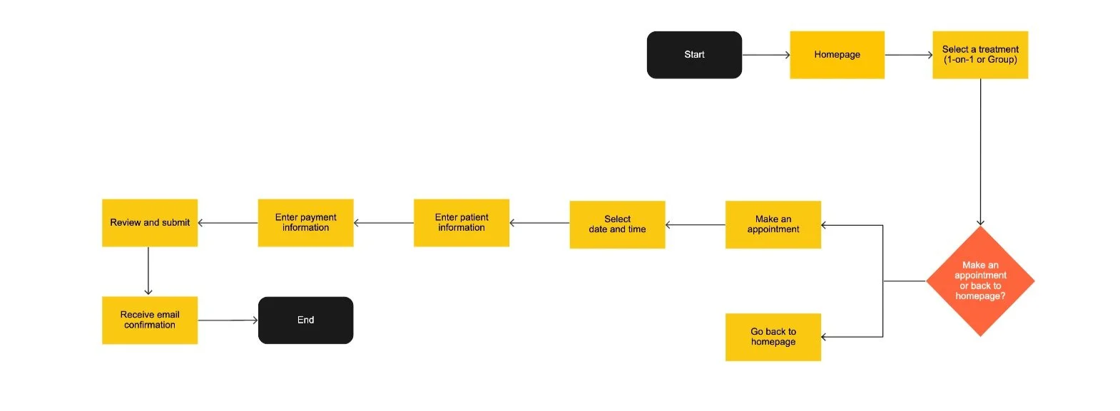
User flow #1:
Making an appointment for a new patient
Lindsay's friend sees an Instagram post about reikiflo and shares the post with her. Lindsay is curious and browse the website, learns about the practice and the practitioner, and reviews the treatment offerings. She wants to try and decides to book a 1-on-1 session.
User flow #2:
Making appointment for recurring patient
Lindsay enjoyed her first 1-on-1 session and is excited to book a follow-up.
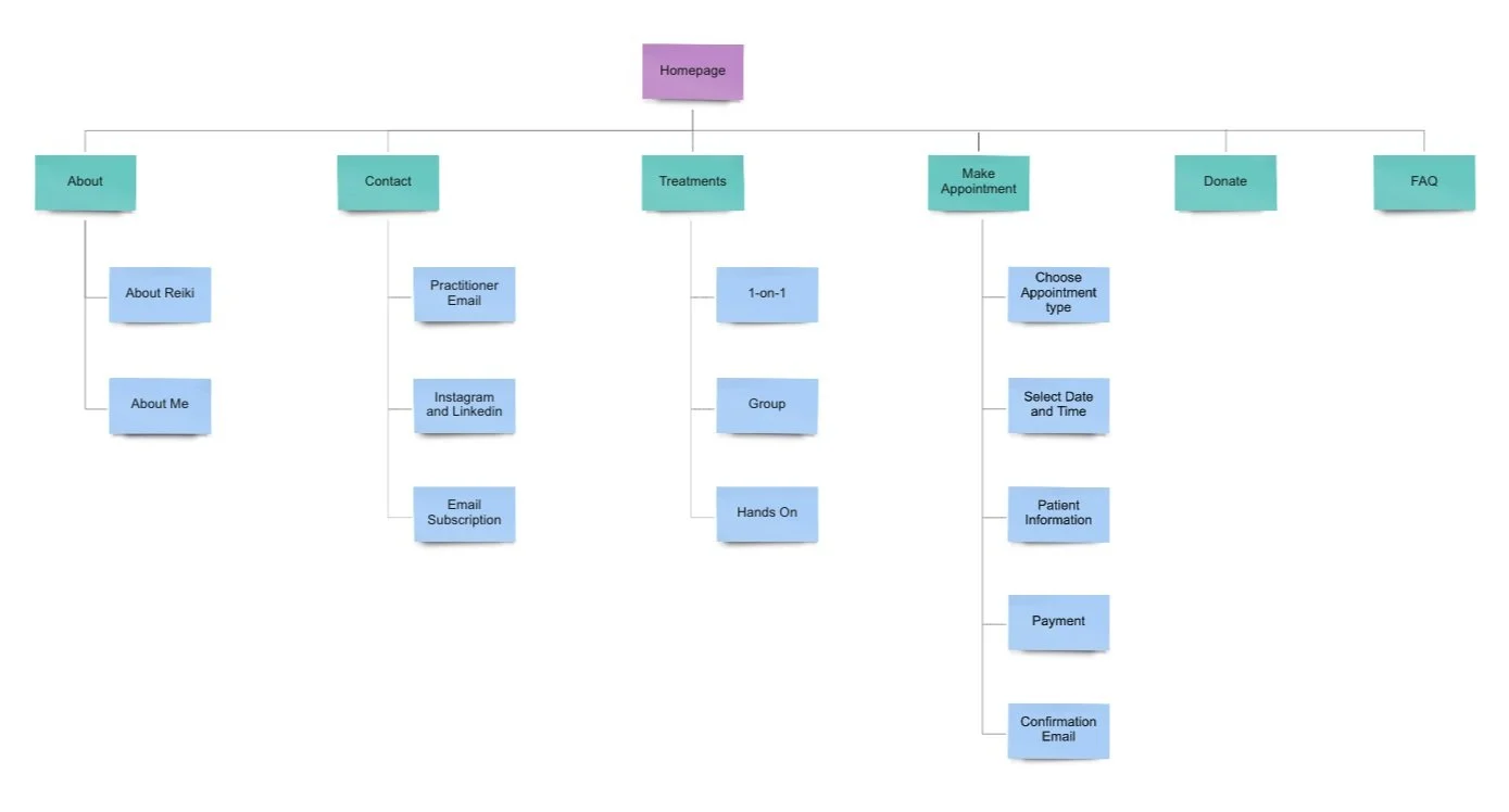
SITE MAP
Thinking about the user flow of how Lindsay browses the website and books an appointment, I created an information architecture of the website including homepage, about, and types of treatments. The about pages introduces the reiki practitioner and history of reiki. The treatment page offers two types of virtual sessions (1-on-1 and group).
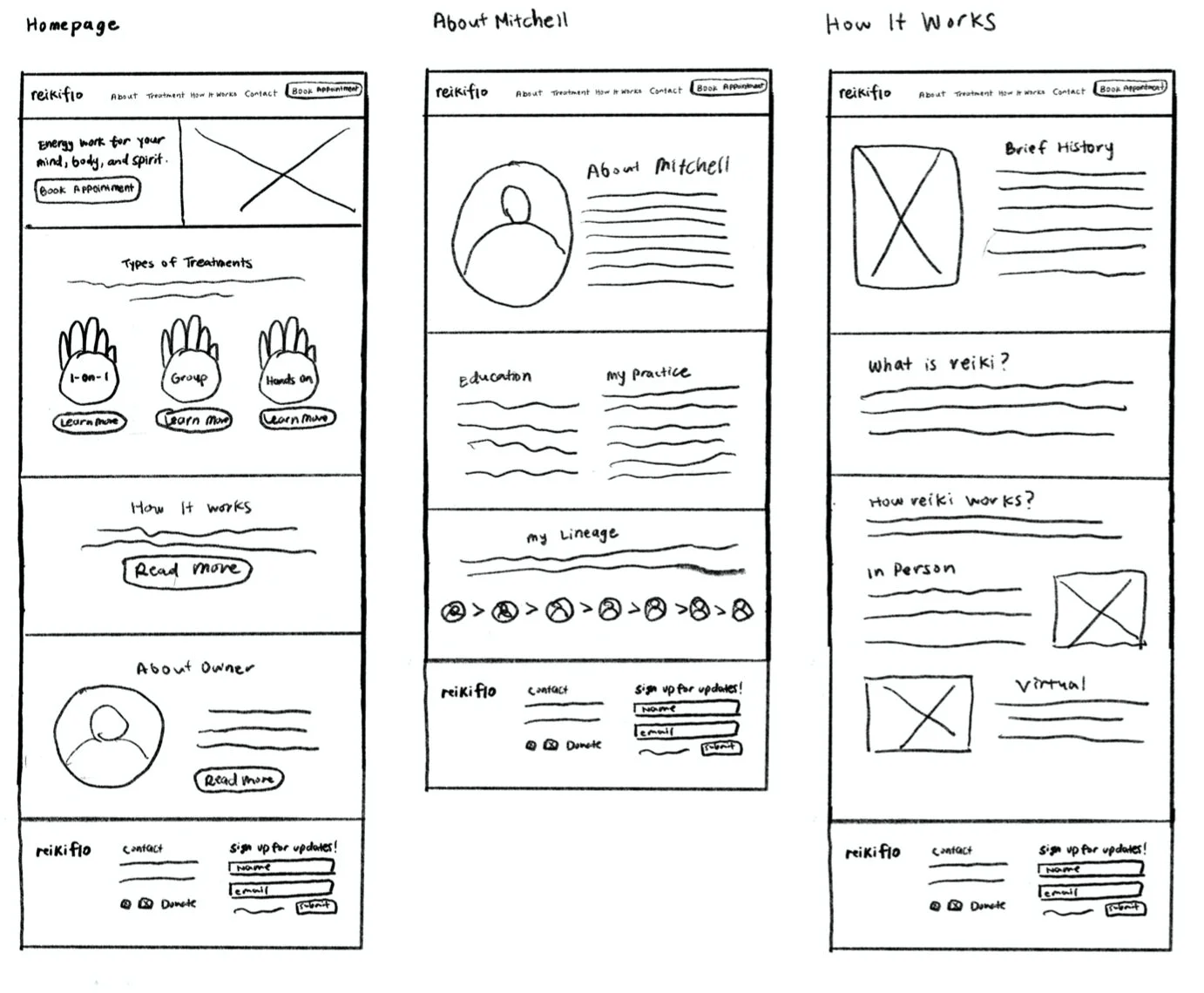
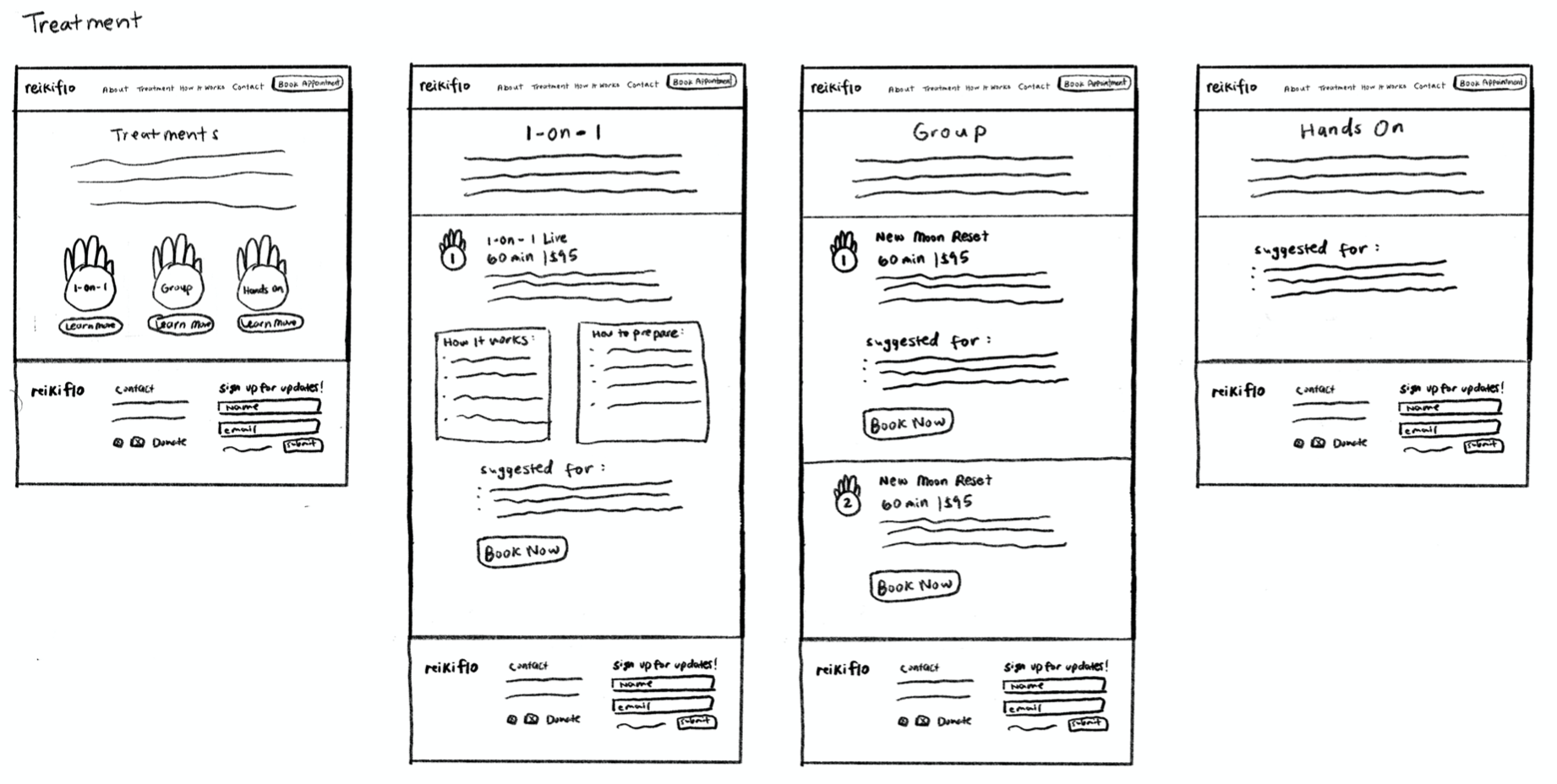
WIREFRAME SKETCHES
Based on the site map, I created wireframe sketches and focused on building pages for Homepage, About Owner, How It Works, Types of Treatments, and Book an Appointment.
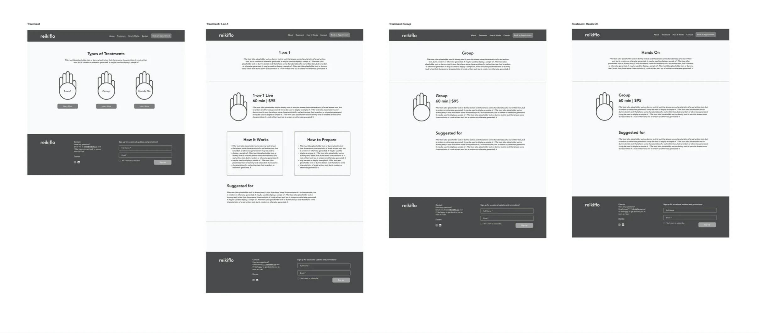
Homepage focuses on a general overview of the sections. For the treatments, I visually organized the different treatments types (1-on-1 and group) by incorporating the palm illustration from the logo. Both about owner and reiki pages are informational and context heavy so I incorporated image blocks to further engage readers and improve readability.
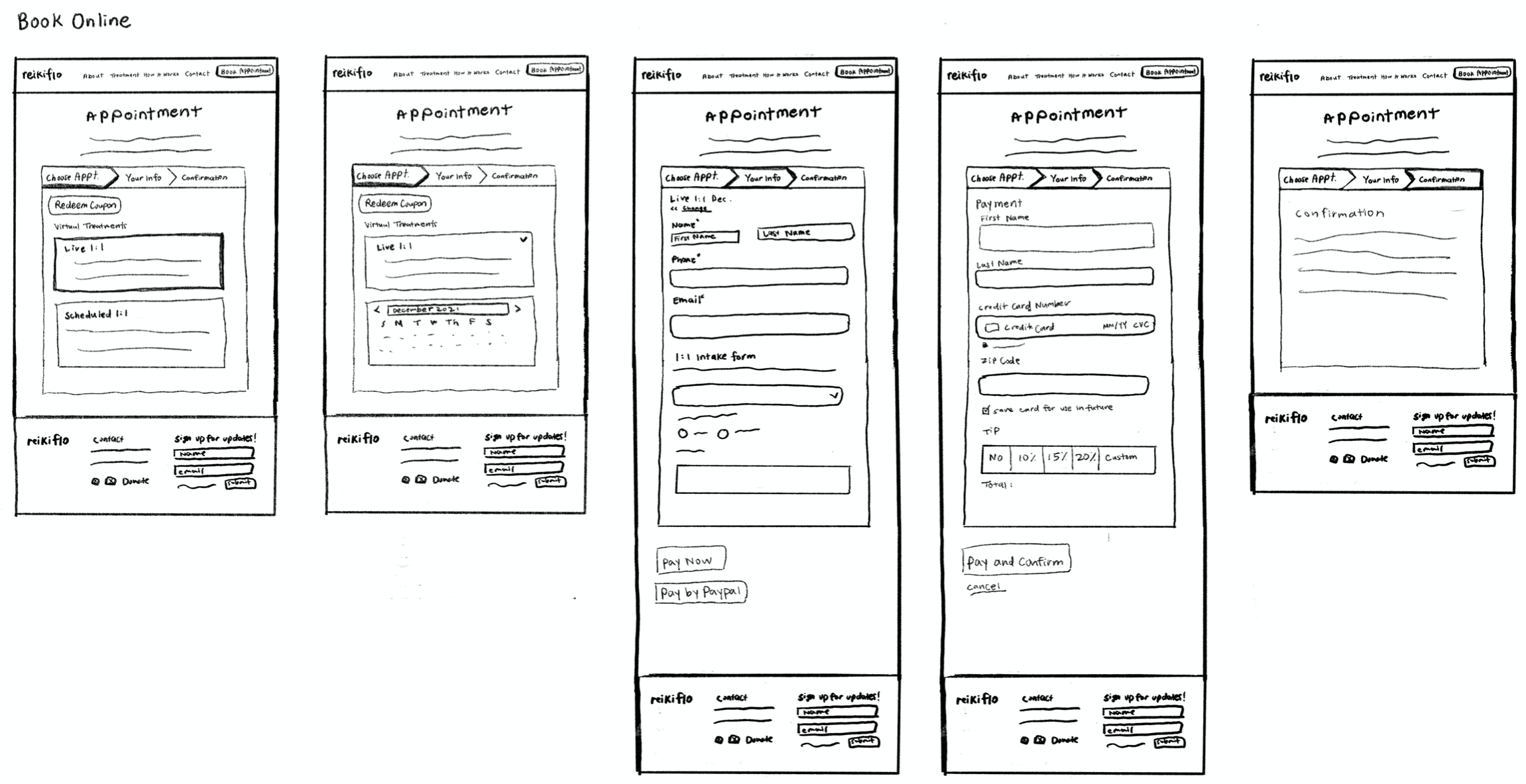
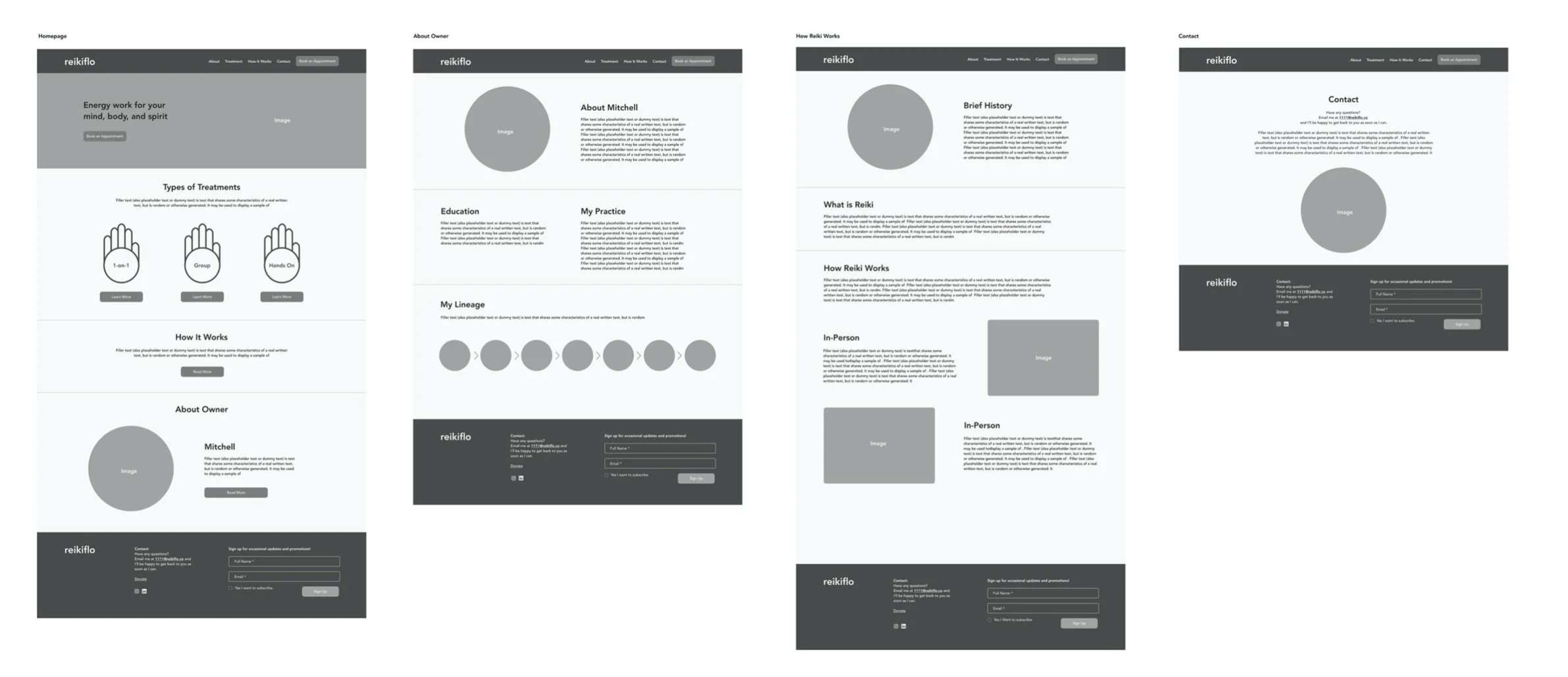
LOW-FIDELITY WIREFRAMES
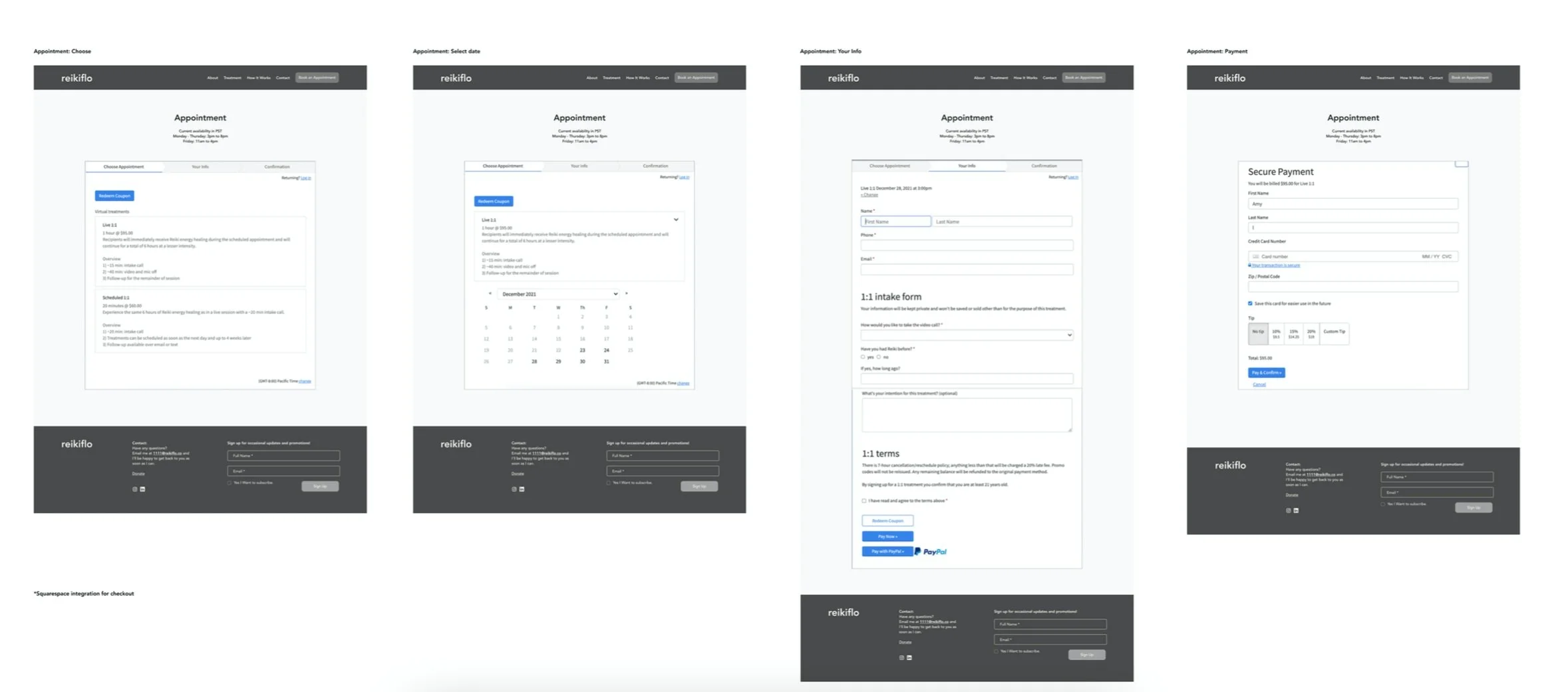
After sketching, I studied the website platform, Wix, to understand the limitations. I added more detailed to the sketches by including icons, hierarchy, and components. Also, after speaking with the client, the booking appointment system will be outsourced and integrated with another platform, Squarespace checkout.
UI STYLE GUIDE
Based on market research and conversations with the client, I created a design system that reflects on the energy and fluidity of reiki practice. The color palette is calming and is inspired by natural elements and the sky. The hand symbol resembles the energy points on the palm.
PROTOTYPE
Based on the low-fidelity wireframes, I created the layouts on Wix and conducted usability testings and have users walk me through how they would find and book a reiki appointment.
USABILITY TESTING
After designing the interface, I conducted a remote usability test to observe and understand how participants navigate the site in order to book an appointment. For this particular test, the users are first time customer new to reiki practice and want to book a group session.
Test Goals
• How users easily complete a task
• Overall quality and flow
• Observe any frustrations
• Discover any user patterns
Participants: 3, Ages: 25-35
• Open to trying self-care rituals
• Interest in reiki
• Book appointments online
NEXT STEPS
Overall, the owner was happy with the website redesign and hand-off. The website and updated brand style guide aligned with brand growth and experience.
Plan for next steps:
• Continue to communicate with client (technical support)
• Walk through design decisions before new updates